tapas restaurant logo design

  • Estado: Closed
  • Premio: $100
  • Propuestas recibidas: 16
  • Ganador: tengkushahril

Resumen del concurso

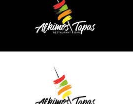
I have a Tapas restaurant and bar that i need a logo design for. The Theme of the restaurant needs to be modern and funky with rustic finishes, and to target the younger generation.

The logo design must only use these colours: BLACK, RED, WHITE, ORANGE, LIME GREEN.

The name of the restaurant is "Alkimos Tapas - Restaurant & Bar"

Can you please emphasise "Alkimos Tapas" and have "Restaurant & Bar" in smaller font underneath.

I have attached some google logo samples that i like the design and fonts of. and have also attached some renders of the restaurant.

Habilidades recomendadas

Comentarios del empleador

“Very artistic and very good quality of work. Most importantly they followed the brief and offered many designs to try satisfy the brief. Highly recommended ”

Imagen del perfil lucad86, Australia.

Tablero de aclaración pública

  • VMJain
    VMJain
    • 7 años atrás

    plz check #81

    • 7 años atrás
  • cretiveman00
    cretiveman00
    • 7 años atrás

    #80

    • 7 años atrás
  • zelimirtrujic
    zelimirtrujic
    • 7 años atrás

    PLS SEE #79

    • 7 años atrás
  • upasnanidhi
    upasnanidhi
    • 7 años atrás

    Please give feedback for #52 .

    • 7 años atrás
  • deydesign
    deydesign
    • 7 años atrás

    plz check my design #56 #57

    • 7 años atrás
  • cretiveman00
    cretiveman00
    • 7 años atrás

    #43

    • 7 años atrás
  • obi183
    obi183
    • 7 años atrás

    Dear Contest Holder, Please provide feedback for entry #18. Thank you!

    • 7 años atrás
  • lucad86
    Organizador del concurso
    • 7 años atrás

    i have added a few more sample logos from google that i like some ideas from.

    • 7 años atrás
  • KianooshBC
    KianooshBC
    • 7 años atrás

    Working . . .

    • 7 años atrás
  • lucad86
    Organizador del concurso
    • 7 años atrás

    please also use colours i have mentioned in the description

    • 7 años atrás
  • lucad86
    Organizador del concurso
    • 7 años atrás

    Flat design is preferred, however the red rectangle and the wave over it does not feel balanced and does not make sense. Need something more creative that ties in better with the text if you are going to use shapes. Thanks.

    • 7 años atrás

Mostrar más comentarios

Cómo comenzar con los concursos

  • Publica tu concurso

    Publica tu concurso Fácil y rápido

  • Recibe montones de propuestas

    Consigue toneladas de propuestas De todo el mundo

  • Elige la mejor propuesta

    Elige la mejor propuesta ¡Descarga fácilmente los archivos!

Publica un concurso ahora o únete a nosotros hoy