imemto
Bangladesh

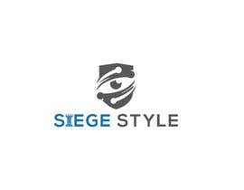
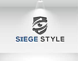
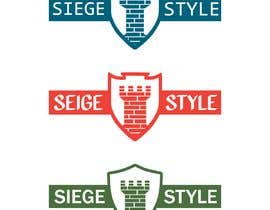
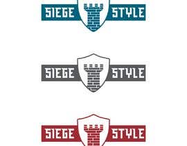
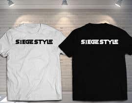
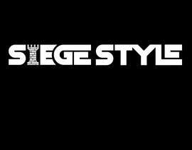
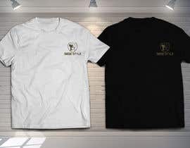
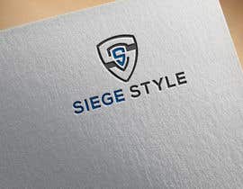
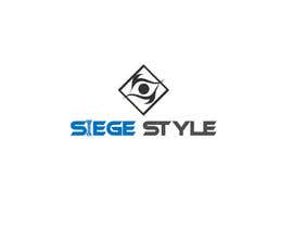
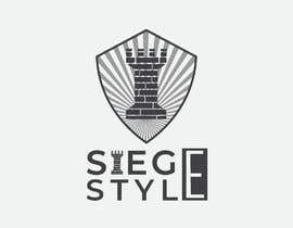
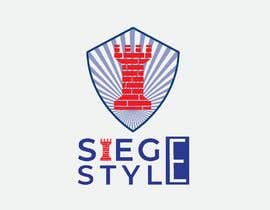
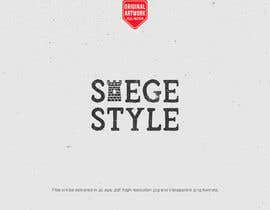
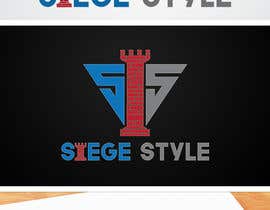
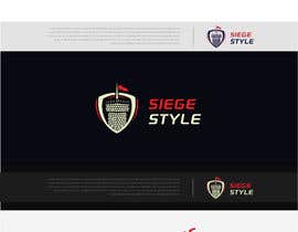
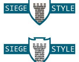
I have a logo that is in need of some updates/redone to look more professional. I have a Business that sells mainly T-Shirts/Tactical gear ect. /American based. Right now i have my logo as a shield and it has tower in the center of the shield which is a "Rook Tower" from the board game of chess. I will show you pictures what i currently have. I would like the "Castle Tower, The Rook" image in a separate file as well because i use it for the i in "Siege Style". I want the tower to look like actual concrete with some details. The shield does not have to be exactly the same as the one i have but if you could get a somewhat close match it would be nice. Unless you find a better one that flows better. I just want the Castle Tower to look more part of the shield and more details. I would like To incorporate my Company name in the logo
( SIEGE STYLE) in or around the shield. Am American theme is welcome, such as 13 stars. My company does a lot of vintage apparel but i want the words readable because this will be printed pretty small on the sleeve, most likely 3x3. Please send me a decent sized file when you send it though. Ai files, j.peg, png, font, the whole package. I'm going to run this for 7 days because it's pretty important to me. I am pretty communicative so i try to respond to most ideas and give input. I want it to look like a badass business instead of what it is now. Thank you for your interest. Vintage and battle worn. 1 color
“Great Job!”
![]() graphicsiege, United States.
graphicsiege, United States.


Publica tu concurso Fácil y rápido

Consigue toneladas de propuestas De todo el mundo

Elige la mejor propuesta ¡Descarga fácilmente los archivos!
