Design a new logo "Good HOME" (business changing name/image)

  • Estado: Closed
  • Premio: $100
  • Propuestas recibidas: 21
  • Ganador: BlackDesign1

Resumen del concurso

WHAT: A new logo, business is changing it's name.

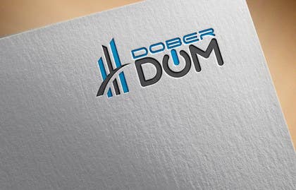
WHAT IS THE NAME: The old name is »i-DOM« the new name and new logo is »Dober DOM«. »Dober DOM« is literally »Good HOME« in English language. But please stick to designing "Dober DOM" as the logo and name is for a non-English country.

WHAT DOES BUSINESS DO: It manages apartment buildings. It organizes cleaning and maintenance ob apartment buildings, provides various services needed to live in a multistory building. It also collects money from owners and organizes construction and maintenance works. It also represents owners of apartments in judicial and other official businesses regarding their apartments in the multistory buildings. As business is focused on apartment buildings it is important to note that it is a business that deals with people. Trust of clients is most important, good relations and care for interests and needs of clients is crucial.

STYLE: Clean, modern. Easily also looks good in black&white, as well as in color.

VALUES LOGO REFLECTS: Durability, Trust, Protection, Happiness, Care, Stability, Friendly people, Good friends. – a good home.

I am attaching examples of the old logo in Adobe Illustrator file format (envelope and stationary paper) and also in PDF.

I am also showing some examples of interesting logo to give you a sense of possible directions. All of the attached logos are interesting, but none of them is perfect.

Bear in mind the challenge for this logo: the nature of this business is difficult as business has all of these elements: elements of a financial institution/bank (taking care of people’s money that is being put aside for future building repairs), elements of authority (making order in and around buildings), elements of construction engineering business (oversight and control of contractors that are doing various works), elements of taking care for the elderly (majority of clients are older or mature people), good communication as most of the business time actually goes to good communication and talking to apartment owners/clients and establishing a good communication link between these clients and 3rd party contractors/builders/plumbers/roofers.

If you have any questions, feel free to contact me.

UPDATE: I also included a PDF of LOGOS OF THE COMPETITION you you get a better feel. It shouldn't just be "Dober DOM" in bold writing and within a frame. Also you are welcome to check out current website to see how current logo is used: www.i-dom.si

Habilidades recomendadas

Comentarios del empleador

“Very responsive, tried to please in every aspect.”

Imagen del perfil beringx, Slovenia.

Tablero de aclaración pública

  • beringx
    Organizador del concurso
    • 6 años atrás

    Alaedin, benthedesigner . You are correct. However you overlooked one key aspect. Together with the project I wrote some text. Not many designers did their homework and really thought through. Business has many customers, who are older. Business also handles their money. A total inovative transition would be a very bad idea. The winning design, intentionally or not, solved that problem. It is not the design that it inovative and perfect from my point of view, but it is perfect for the duration of next 12 months or so. Only then will the clients be ready for another change and a very original logo. I saved your designs and when time comes, I will pull them out to contact you.

    • 6 años atrás
    1. Alaedin
      Alaedin
      • 6 años atrás

      I'll be there whenever you require my services. Thanks.

      • 6 años atrás
    2. artsigma11
      artsigma11
      • 6 años atrás

      Please check #174

      • 6 años atrás
  • Alaedin
    Alaedin
    • 6 años atrás

    Not to be envy or anything. It's just I don't see anything special in it. Just another modified copy from the internet. They're all over the internet.

    https://www.google.ae/search?q=real+estate+logo&tbm=isch&tbs=rimg:CVS-Kgd8DlcQIjhM4HFLCdZFbkacrPQ2hFkUc_1Ik7JvcE8MXr79g-5WGxhmUcQYH8oHL47mkfE2pygDVa2sLvolEmCoSCUzgcUsJ1kVuEaM7yPBB01LvKhIJRpys9DaEWRQRL-8pe5qR_1R8qEglz8iTsm9wTwxFo30zt_1qMOZSoSCRevv2D7lYbGET-levh9hbyJKhIJGZRxBgfygcsRL8OZdEwtn6EqEgnjuaR8TanKABGJDzlPWSYMsyoSCdVrawu-iUSYEUnyMEZZLThz&tbo=u&sa=X&ved=0ahUKEwjmwOq1k4vVAhXDuhQKHWTYB54Q9C8IHw&biw=1920&bih=974&dpr=1

    • 6 años atrás
    1. benthedesigner
      benthedesigner
      • 6 años atrás

      Yeah, but somehow people like those overused icons and fear new approaches.

      • 6 años atrás
    2. beringx
      Organizador del concurso
      • 6 años atrás

      Alaedin, benthedesigner . You are correct. However you overlooked one key aspect. Together with the project I wrote some text. Not many designers did their homework and really thought through. Business has many customers, who are older. Business also handles their money. A total inovative transition would be a very bad idea. The winning design, intentionally or not, solved that problem. It is not the design that it inovative and perfect from my point of view, but it is perfect for the duration of next 12 months or so. Only then will the clients be ready for another change and a very original logo. I saved your designs and when time comes, I will pull them out to contact you.

      • 6 años atrás
  • saifydzynerpro
    saifydzynerpro
    • 6 años atrás

    Please check #176 #177

    • 6 años atrás
  • MurtazaLashkery
    MurtazaLashkery
    • 6 años atrás

    Kindly check #175

    • 6 años atrás
  • Alaedin
    Alaedin
    • 6 años atrás

    Hi there. Can you please check entries #130, #131,#132,#133. Thanks.

    • 6 años atrás
  • Junaidy88
    Junaidy88
    • 6 años atrás

    Please check my entry # 139, 140. Thank you!

    • 6 años atrás
  • SantanuHait
    SantanuHait
    • 6 años atrás

    Please check and review.. #119 #120 #121 #122 #123 #124 #125 #126

    • 6 años atrás
  • naimrezamnr
    naimrezamnr
    • 6 años atrás

    please check #115 #116 thank you.

    • 6 años atrás
  • Alaedin
    Alaedin
    • 6 años atrás

    Hi there. Please let me know your thoughts on entry #103. Thanks!

    • 6 años atrás
  • naimrezamnr
    naimrezamnr
    • 6 años atrás

    please check #81 #82 thank you

    • 6 años atrás
  • SantanuHait
    SantanuHait
    • 6 años atrás

    Please check and review.. #61 #63

    • 6 años atrás
    1. beringx
      Organizador del concurso
      • 6 años atrás

      I like it. I am not yet sure, if this is the most appropriate logo. But it is definitely a logo that gives a strong positive message. I will test it with my test subjects.

      • 6 años atrás
    2. SantanuHait
      SantanuHait
      • 6 años atrás

      Thanks.. If you require any changes please feel free..

      • 6 años atrás
  • naimrezamnr
    naimrezamnr
    • 6 años atrás

    please check #81 #82 thank you

    • 6 años atrás
  • Alaedin
    Alaedin
    • 6 años atrás

    Hi. Waiting for your feedback on entry #83. Thanks.

    • 6 años atrás
  • naimrezamnr
    naimrezamnr
    • 6 años atrás

    please check #81 #82 thank you

    • 6 años atrás
  • aminotun720
    aminotun720
    • 6 años atrás

    please check#27

    • 6 años atrás
    1. beringx
      Organizador del concurso
      • 6 años atrás

      Hi. Sorry, but the logo is not appropriate. The letter with the O would be too small. It's not a concept that will work in my business.

      • 6 años atrás
  • NikeStudio
    NikeStudio
    • 6 años atrás

    please check #55 #56

    • 6 años atrás
    1. beringx
      Organizador del concurso
      • 6 años atrás

      Sorry for not writing earlier. This logo is one of my favorites. I shall put it in front of my test subjects and see their resposne. I will write again later.

      • 6 años atrás
  • TALHAZUBAIR123
    TALHAZUBAIR123
    • 6 años atrás

    check please #57

    • 6 años atrás
    1. beringx
      Organizador del concurso
      • 6 años atrás

      Hello, sory for not writing earlier. It is a relatively smart logo. I shall put additional review later. We are in no hurry.

      • 6 años atrás
  • naimrezamnr
    naimrezamnr
    • 6 años atrás

    Please check #71 #72

    • 6 años atrás
  • Runner247
    Runner247
    • 6 años atrás

    plz check #44 #45 #46

    • 6 años atrás
  • beringx
    Organizador del concurso
    • 6 años atrás

    To get a better feel of how logo is used, you can check out current website: http://www.i-dom.si

    • 6 años atrás
  • Alaedin
    Alaedin
    • 6 años atrás

    Hi. Can you make this contest sealed please. #sealed.
    Thank you.

    • 6 años atrás
    1. beringx
      Organizador del concurso
      • 6 años atrás

      It is now sealed.

      • 6 años atrás
  • beringx
    Organizador del concurso
    • 6 años atrás

    Also be sure to view PDF with stationary (envelope...) of current old logo. I also included adobe files of the old logo so you can get the exact blue color.

    • 6 años atrás
  • beringx
    Organizador del concurso
    • 6 años atrás

    I uploaded a PDF with logos of competition. You should see this, so you can better understand what it takes to have a better logo.

    • 6 años atrás
  • beringx
    Organizador del concurso
    • 6 años atrás

    Competition is now sealed.

    • 6 años atrás

Mostrar más comentarios

Cómo comenzar con los concursos

  • Publica tu concurso

    Publica tu concurso Fácil y rápido

  • Recibe montones de propuestas

    Consigue toneladas de propuestas De todo el mundo

  • Elige la mejor propuesta

    Elige la mejor propuesta ¡Descarga fácilmente los archivos!

Publica un concurso ahora o únete a nosotros hoy