Freelancer: Triston731
Compartir:
Reportar entrada

Lipe Line Brand

Your company's very unique name allowed for a lot of playful typography. I enlarged the "L" to account for both and created the the freight stack for the "I" in both words. The rectangular shape with perspective symbolizes the trailer. I chose a type that I feel also represented a simpler time, yester years TV programs like (i.e. Bonanza, Gunsmoke, & The Beverly Hillbillies) all came to mind when selecting this font.
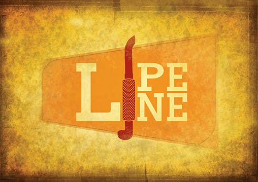
Participación en el concurso Nro.213 para                                                 Design a Logo for Trucking Company
Participación Nro. 213

Tablero de aclaración pública

  • NH3Service
    Organizador del concurso
    • 10 años atrás

    This is an interesting concept but the logo itself would be easier to present if it didn't have the filter/affect applied to it. Also, this would be difficult to have embroidered.

    • 10 años atrás