Design a Logo
- Estado: Closed
- Premio: $420
- Propuestas recibidas: 267
- Ganador: pconcepcion90

Resumen del concurso
Get Better At Life (GBAL.com) is a life improvement website that provides users information, tips and tricks on how to improve how they manage various aspects of their life including:
Fitness; Health; Nutrition; Diet; Finances/Money Management; Travel & Holidays; Family; Mindfulness; Happiness; DIY; Learning / Self-improvement; Critical Thinking Skills; Productivity Work (be more effective); Career Development; Technology & Gadgets; Shopping (online shopping tips, in-store shopping tips); Fashion.
The website will have a different page/section for each of the above topic and the navigation structure will be 'Get Better At....Health' or 'Get Better At...Finances' and each section will have resources providing information on the selected topic. This is just a concept for now so I'll worry about the website later, focus for now is on the logo.
So the logo could either be GBAL (or GBAL.com) or the full Getter Better At Life, or both (happy to pay a bit extra for this if both).
Open to ideas on the concept of the logo but it needs to appeal to both men and women, young and old. I have a personal preference for colourful logos but that need not influence the designer too much - it's about getting the logo that will convey the concept and appeal to most people.
One idea I had was to have each of the topics above represented by an icon and these icons are mixed together to form the word GBAL (or Get Better At Life). E.g. a lady in a dress could make up part of the L, a dumbbell could make up the horizontal bar in the A etc. If this has been done too much and is now cliched, that's fine, we don't have to stick to it.
I want to ensure the broad focus of the website is apparent, i.e. that it's not just a fitness website: the value proposition will be that this is a one-stop shop where you can go to get great tips on a wide range of topics.
I won't be developing the site in earnest for a few months, but if you think it makes more sense to do a logo design and an outline of the website design now, please let me know and I'll consider changing the request (though this is likely to not be a revenue earner, more a self-help site I run on the side to give helpful advice to people, so I don't have a lot of funds for it, may end up having to try develop the site myself, so investing in a quality logo and branding is the priority for now).
Habilidades recomendadas
Comentarios del empleador
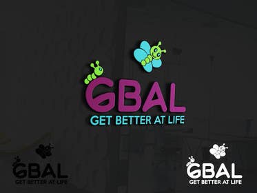
“@pconcepcion90 won the contest on 8 March 2016”
![]() OhPinchy, Ireland.
OhPinchy, Ireland.
Tablero de aclaración pública
-

Organizador del concurso - 8 años atrás
Thanks all for your submissions. Contest winner has been awarded to pconcepcion90 whose design was excellent from outset, really tried to achieve the brief, and tweaked it with a lot of polish. Thanks all
- 8 años atrás
Ver 1 mensaje mas
-

tauhidpias123
- 8 años atrás
As for changing the concepts several times we tried to get you good design and the last instructions were clear and there are some lack in the winning entry (Personal opinion). The butterfly should have very happy face and GBAL must clean to read for the first look. Anyone can see if these requirements meet or not in the winning entry! However this is your decision. We all respect. Thank You. Bye!
- 8 años atrás
-
Organizador del concurso - 8 años atrás
Thank you, and all designers who submitted entries, for your efforts. As previously mentioned, I apologise for any extra effort caused by the change in concept, though I gave full transparency on my thinking throughout. I'm very happy with the winning entry. The G will be tweaked, I just wanted to mark it as the Winner as soon as I decided it would be my choice to prevent any unnecessary further work from other designers. All the best.
- 8 años atrás
-

Nadimboukhdhir
- 8 años atrás
Please check #534 #535 , thanks
- 8 años atrás
-

dreamer509
- 8 años atrás
Check #542 only. Is it still like copied?
- 8 años atrás
-
dreamer509
- 8 años atrás
#540 and #541 also.
- 8 años atrás
-
Organizador del concurso - 8 años atrás
dreamer509 - that character does look like a direct copy of the one linked. As previously mentioned, only original work will be considered. I do not want any risk of falling into copyright infringement issues down the line.
- 8 años atrás
-

pconcepcion90
- 8 años atrás
Hi ch check my private message
- 8 años atrás
-

Pato24
- 8 años atrás
pls #559
- 8 años atrás
-

impact99
- 8 años atrás
#558 please check
- 8 años atrás
-
Organizador del concurso - 8 años atrás
So having the body and face of the character (the caterpillar) in one colour (probably green or light blue) and then the wings in another colour (open to suggestions, doesn't have to be purple) will probably be the best way of making it look like it's a caterpillar with butterfly wings.
- 8 años atrás
-
tauhidpias123
- 8 años atrás
Please check: #550 #551 #552 #554 #555 #556
- 8 años atrás
-

kingdziner
- 8 años atrás
#477 , #478 , #479 .. have a look sir ..
- 8 años atrás
-
dreamer509
- 8 años atrás
Rate for #542 . Regards!
- 8 años atrás
-
dreamer509
- 8 años atrás
- 8 años atrás
-
tauhidpias123
- 8 años atrás
Please check: #528 #530 #531 #532
- 8 años atrás
-

winkeltriple
- 8 años atrás
Please check private message and give feedback.
- 8 años atrás
-
Organizador del concurso - 8 años atrás
I think having two separate characters, caterpillar on the left and butterfly on the right is proving too complicated, so please focus your efforts in the combined caterpillar-with-butterfly-wings ideas. If it looks best standing alone either side of the GBAL, that's fine, but if there is a neat way to connect it to the font, that would be great. Also, much of the fonts are very static and plain. I am intersted to see fonts that are not plain and change the shape of the letters a bit to make it more unique....but must still be easy to read.
- 8 años atrás
-
tauhidpias123
- 8 años atrás
Please check: #516 #517 #518 #519 #520
- 8 años atrás
-

faizulhassan1
- 8 años atrás
updated #523
- 8 años atrás
-
Nadimboukhdhir
- 8 años atrás
Copied : http://png.clipart.me/graphics/previews/139/smiling-butterflies-cartoon-mascot-characters-vector-collection-set_139921684.jpg
- 8 años atrás
-
tauhidpias123
- 8 años atrás
Please check: #521 #522
- 8 años atrás
-
dreamer509
- 8 años atrás
Check #492 . #493 and #494 . Regards!
- 8 años atrás
-
dreamer509
- 8 años atrás
Hello rate for #450. Isn't that right track?
- 8 años atrás
-
kingdziner
- 8 años atrás
#479 ..
- 8 años atrás
-
kingdziner
- 8 años atrás
Thank you .. :)
- 8 años atrás
-
kingdziner
- 8 años atrás
Kindly check it and let me know about it ..
- 8 años atrás
-
kingdziner
- 8 años atrás
#478 ..
- 8 años atrás
-
kingdziner
- 8 años atrás
#477 ..
- 8 años atrás
-
tauhidpias123
- 8 años atrás
Please check: #472 #473 #474 #475 #476
- 8 años atrás
-
kingdziner
- 8 años atrás
Thank you .. :)
- 8 años atrás
-
kingdziner
- 8 años atrás
Kindly check them all entries ..
- 8 años atrás
-
kingdziner
- 8 años atrás
#470 ..
- 8 años atrás
-
kingdziner
- 8 años atrás
#469 ..
- 8 años atrás
-
kingdziner
- 8 años atrás
Thank you .. :)
- 8 años atrás
-
kingdziner
- 8 años atrás
sir give me good feed back ..
- 8 años atrás
-
kingdziner
- 8 años atrás
#468 ..
- 8 años atrás
-
kingdziner
- 8 años atrás
Kindly check it my entry .. i shall be waiting for kindly feed back .. thank you .. :)
- 8 años atrás
-
kingdziner
- 8 años atrás
#467 ..
- 8 años atrás
-
kingdziner
- 8 años atrás
I AM WORKING ON IT ..
- 8 años atrás
-
kingdziner
- 8 años atrás
#466 ..
- 8 años atrás
-
Organizador del concurso - 8 años atrás
Link: https://www.google.ie/search?q=butterfly+cartoon&espv=2&biw=1920&bih=940&tbm=isch&imgil=4DSYtf529ddyIM%253A%253BOPt0K8ar4_togM%253Bhttp%25253A%25252F%25252Fwww.dreamstime.com%25252Fstock-photography-colorful-cartoon-butterfly-image14219782&source=iu&pf=m&fir=4DSYtf529ddyIM%253A%252COPt0K8ar4_togM%252C_&usg=__0bkvdNDKYPCQUqLBI0dRdZ-K1Es%3D#tbm=isch&tbs=rimg%3ACeA0mLX-dvXXIjgbO02RLzq0xWdHLvKMG_1nFhxeYDr05nfsd0V5rfEUshjtnMjzpWyoJw68uuj3dshfp4dyM4fFEnSoSCRs7TZEvOrTFEcQ9VFfMQoVpKhIJZ0cu8owb-cUR4-HmmBz6POUqEgmHF5gOvTmd-xHGiyWrSENP_1CoSCR3RXmt8RSyGEYa4KFPhfJhAKhIJO2cyPOlbKgkRxyHg8ALiVPUqEgnDry66Pd2yFxEtAnt9yLc96ioSCenh3Izh8USdEd23NOpnAn5h&q=butterfly%20cartoon
- 8 años atrás
-
Organizador del concurso - 8 años atrás
Can't see a way to upload an image, so here's a link to a Google search that shows some nice cartoon-style butterfly/caterpillar characters that have plenty of personality. Some of the green ones in particular do really look like it is a caterpillar with butterfly wings - this is the idea that I'm looking for. Not saying to replicate those cartoons, I want something that has only 2 or 3 colours and is simple but still conveys the idea clearly that it is a caterpillar with butterfly wings. Showing the 4 wings from front or top-down view is probably better than side view which shows only 2 wings.
- 8 años atrás
-
chtanveeritp
- 8 años atrás
check sir #461
- 8 años atrás
-
Organizador del concurso - 8 años atrás
Thanks for recent submission, I like some of the butterfly concept ideas. There is no no necessity to include the .com: if it fits in neatly, please include it, but if it detracts from the logo aesthetics, please remove it (it's not sitting well in most cases so it seems awkward to fit it in).
- 8 años atrás
-
pconcepcion90
- 8 años atrás
Updated my entry private message me :)
- 8 años atrás
-
winkeltriple
- 8 años atrás
Please check private message.
- 8 años atrás
-
Organizador del concurso - 8 años atrás
I hope from within those 2 concepts there is enough clarity on the remit and scope for creativity, and look forward to seeing the designs for this concept - the winning submission will come from this concept, not the previous ones as the feedback is clear that the earlier concepts were too complicated.
- 8 años atrás
-
kingdziner
- 8 años atrás
i am working on it //
- 8 años atrás
-
faizulhassan1
- 8 años atrás
Thanks For Appreciating...i will submit best of my designs.
- 8 años atrás
Cómo comenzar con los concursos
-

Publica tu concurso Fácil y rápido
-

Consigue toneladas de propuestas De todo el mundo
-

Elige la mejor propuesta ¡Descarga fácilmente los archivos!