Freelancer: king5isher
Compartir:
Reportar entrada

App Design

Hi, This is revised design, hope you will like this design. If you think something need to change please feel free to tell me. I am always ready to change it. One important thing the DOCUMENTATION PART WILL BE DONE AFTER DESIGN IS FINALISED. If I do now I have to change it frequently since the design is not finalised and I am revising it frequently. So it will be difficult to maintain the document if the screen and colour is ever changing .Don't be worry I will provide you all thing Including design, Documentation (mentioning guideline of App design). Hope that much will be ok. Thanks, Have a Good Day.
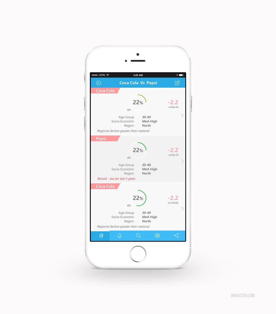
Participación en el concurso Nro.4 para                                                 Colour palette, icons and text layout in 2 screens of an iOS app (paleta de colores, iconos y manejo de texto para 2 pantallas de una app en iOS)
Participación Nro. 4

Tablero de aclaración pública

  • king5isher
    king5isher
    • 9 años atrás

    I will make another revision with all things you mentioned here. As the contest period is over no longer accept entry now. So, I will send you a Dropbox link of my design for view. Check here below this message after few hours(4-5)

    • 9 años atrás
    1. daquinoulsa
      Organizador del concurso
      • 9 años atrás

      Hey. Thanks for that, I´ve extended the contest so we can keep working. The proposed design looks good, but too pink.

      • 9 años atrás
    2. king5isher
      king5isher
      • 9 años atrás

      Just got to know that contest is extended. Thanks. I will submit with some change in UI design soon.
      0 secs ago

      • 9 años atrás
  • king5isher
    king5isher
    • 9 años atrás

    Hi, Here is the Dropbox link--- https://www.dropbox.com/sh/gvax1c6lahom53z/AADM-kGo-gYc-dLqpQccT7E_a?dl=0

    • 9 años atrás
    1. king5isher
      king5isher
      • 9 años atrás

      Please have a look.(Please Don't share it with anyone). Thanks

      • 9 años atrás
  • king5isher
    king5isher
    • 9 años atrás

    My Laptop was not working and send for servicing. I got it now. I will submit new revision as soon as possible... Sorry for the interrupt. Will see soon...Thanks

    • 9 años atrás
  • king5isher
    king5isher
    • 9 años atrás

    Hi, Sorry for late reply. My laptop was not working... Expecting it in next few hours. I will start as soon as I get back it . Thanks for waiting me.. Will see soon.

    • 9 años atrás
  • daquinoulsa
    Organizador del concurso
    • 9 años atrás

    Finally, please let me ask you to try something in red (for the main toolbars in the app). Have a look at the iOS Mail app, and let's see if that style, but using red, would work. Cheers!

    • 9 años atrás
    1. king5isher
      king5isher
      • 9 años atrás

      Okey .. Wiil show you...

      • 9 años atrás
  • daquinoulsa
    Organizador del concurso
    • 9 años atrás

    About the icon. I like having the figure '3' in there, but I still don't relate the icon to the main screen. Could we try an icon where three horizontal blocks are shown?

    • 9 años atrás
  • daquinoulsa
    Organizador del concurso
    • 9 años atrás

    For entry #4 (second screen), please modify the font of the headings or the KPI. Note that you made the KPI ("Product I make an effort to avoid") green and italics, similar to "Other categories' performance on this KPI", which is not a KPI but a heading. At the bottom, you forgot to include the heading "Products I make an effort to avoid in other targets". Finally, I think users would find it a bit hard to 'flow' visually from "CSDs: 12%" across to "+0.2", can you think of a way to make these elements closer together?

    • 9 años atrás
  • daquinoulsa
    Organizador del concurso
    • 9 años atrás

    Please also make the -2.2 more prominent. Remember that it is the most important piece of information in the screen. The 22% is only secondary.

    • 9 años atrás
  • daquinoulsa
    Organizador del concurso
    • 9 años atrás

    Hi. Thanks for the revision, I like a lot the way you've decided to put the name of the brands. However, I´m a bit hesitant that it would look as nice with long brand names. As stated on the brief, please make an example with 30 characters. Same thing for the KPI: the font is too small. Please give it more relevance, and try one where the label is 50 characters long.

    • 9 años atrás

Mostrar más comentarios Procesando...