Design a Logo

  • Estado: Closed
  • Premio: €70
  • Propuestas recibidas: 2
  • Ganador: marvinbaldemor36

Resumen del concurso

Hello,

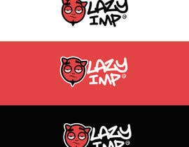
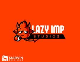
We’re an indie game development team called Lazy Imp and we require a logo matching our name.
Our vision is a simplistic (2-3 colors) 'Imp' looking shape. The imp should denote more or less a lazy/sleepy emotion.

Maybe a fat imp with a coffee leaning on the name, or a sleepy (but more towards laziness, mood less, without energy) face of an imp, doesn’t necessarily have to illustrate the whole body or any other position/situation which would portray these emotions.

IMPORTANT: Keep it simple, don’t make it very detailed, we want something that can be put on a card and still be intelligible.

We want a creative and clean logo. If you illustrate it on a company card/wall template, it would allow us to imagine your entry clearer.

Attached there will be examples of styles that may help you understand our vision; do not limit yourselves to the references, try to use them just for inspiration.

Please note that, while coming up with a good color combination from start may make an entry look better, the logo itself is still more important.

ATTENTION:
Do not use someone else’s work; your entries need to be made completely by yourselves.
The winner entry will have its rights and ownership transferred to us.

Habilidades recomendadas

Comentarios del empleador

“Marvin did a good job for our company logo. He was very responsive and quick when it came to the changes that we wanted. Would work with him again. :)”

Imagen del perfil LazyImp, Romania.

Principales propuestas de este concurso

Ver más participaciones

Tablero de aclaración pública

  • achrafhamza
    achrafhamza
    • 6 años atrás

    entry #74 will like you see i didnt chos edo mascot but i chose do the space negative styl in this logo becouse is good idea and like you want simple and becouse mascot we use in playful logo or sport team or somethign liek thats so the mascot need to be professionelle and have idea the idea of my desgin is all on too word M and Z the m is like fhead of imp and Z wich meanin sleeping imp and thsi have meaning of lazy and the last Z have look of imp i hope you like my idea

    • 6 años atrás
  • GirottiGabriel
    GirottiGabriel
    • 6 años atrás

    Please check #72 and #73 Thanks!

    • 6 años atrás
  • GirottiGabriel
    GirottiGabriel
    • 6 años atrás

    Please check #72 Thanks!

    • 6 años atrás
  • LazyImp
    Organizador del concurso
    • 6 años atrás

    Thank you for your entries. Most of them have more devilish look than an imp. If you could try something more similar to an imp it would be nicer. Also currently there are 2 entries that we liked so far. We will wait until the end of the contest to award the winner. Good luck!!

    • 6 años atrás
  • AngAto
    AngAto
    • 6 años atrás

    Please check Entry #48 thank you

    • 6 años atrás
  • marvinbaldemor36
    marvinbaldemor36
    • 6 años atrás

    Please wait for my entry thanks!

    • 6 años atrás
  • anthonyjpg
    anthonyjpg
    • 6 años atrás

    Please Check #15 #16 #17 #18 #19.
    Thanks.

    • 6 años atrás

Mostrar más comentarios

Cómo comenzar con los concursos

  • Publica tu concurso

    Publica tu concurso Fácil y rápido

  • Recibe montones de propuestas

    Consigue toneladas de propuestas De todo el mundo

  • Elige la mejor propuesta

    Elige la mejor propuesta ¡Descarga fácilmente los archivos!

Publica un concurso ahora o únete a nosotros hoy