Brand Re-Vamp

  • Estado: Closed
  • Premio: $710
  • Propuestas recibidas: 175
  • Ganador: claudiadebsas

Resumen del concurso

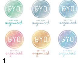
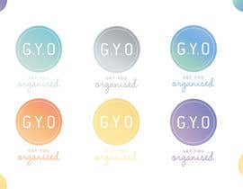
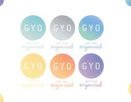
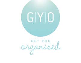
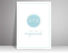
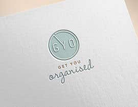
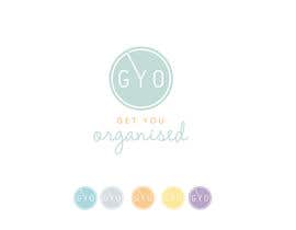
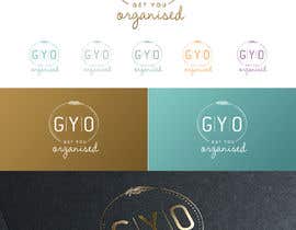
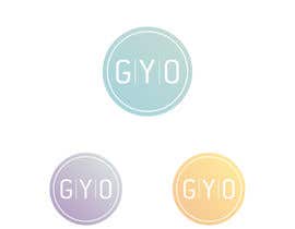
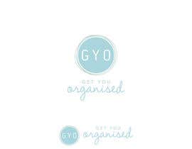
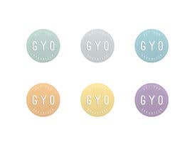
We have an existing Brand with several logo Versions (colours), colour schema etc. We're happy with the logos and brand colours.

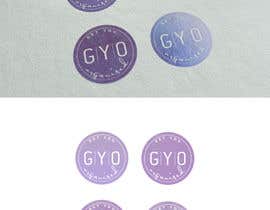
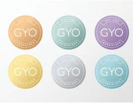
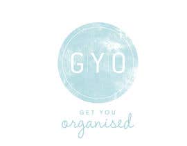
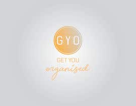
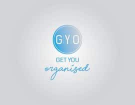
Interested in having some work done to update the design (possibly adding depth), SUBTLE gradient work. The logo we use the most is the circle, sometimes the circle with the text below.

We want to move away from an entirely FLAT image, but that does NOT mean adding ugly shadows/embossing. Check out how tinder has been using gradient work, for what im talking about.

Phase two is stationary update.

Habilidades recomendadas

Comentarios del empleador

“Claudia made all the changes we requested and in a timely manner. She was pleasant and lovely to deal with. I will use her for future graphic design work. ”

Imagen del perfil gyo123, Australia.

Principales propuestas de este concurso

Ver más participaciones

Tablero de aclaración pública

  • mdnazimsarder
    mdnazimsarder
    • 5 años atrás

    Please check entry no. #914 #915 #916

    • 5 años atrás
  • farhadalam570
    farhadalam570
    • 5 años atrás

    Please check #855

    • 5 años atrás
  • AR1069
    AR1069
    • 5 años atrás

    Sir, please check my entry #833 , #834 , #835 and #836 . If any change need let me know.

    • 5 años atrás
  • Cbox9
    Cbox9
    • 5 años atrás

    #875

    • 5 años atrás
  • sleekdesigner1
    sleekdesigner1
    • 5 años atrás

    #905

    • 5 años atrás
  • luisarmandojeda
    luisarmandojeda
    • 5 años atrás

    Please check #930

    • 5 años atrás
  • nandagasperini
    nandagasperini
    • 5 años atrás

    #877 and #876 pls. Thank you!

    • 5 años atrás
  • sharthokrasel
    sharthokrasel
    • 5 años atrás

    check sir b #901 #902

    • 5 años atrás
  • adspot
    adspot
    • 5 años atrás

    please check #898 #903

    • 5 años atrás
  • Nunaram
    Nunaram
    • 5 años atrás

    please check #894

    • 5 años atrás
  • Cbox9
    Cbox9
    • 5 años atrás

    #875

    • 5 años atrás
  • aarushvarma
    aarushvarma
    • 5 años atrás

    Hi there! Please check #723 . Thank you

    • 5 años atrás
  • kanchanverma2488
    kanchanverma2488
    • 5 años atrás

    feedback please #842 #843 #844 #845

    • 5 años atrás
  • junkmailhater
    junkmailhater
    • 5 años atrás

    #840 is my submitted work!

    • 5 años atrás
  • praxlab
    praxlab
    • 5 años atrás

    #800 #801 Your views please. Thanks

    • 5 años atrás
  • Optimisticasad
    Optimisticasad
    • 5 años atrás

    Also #812 , #813

    • 5 años atrás
  • sumonhosen888
    sumonhosen888
    • 5 años atrás

    #811 check please

    • 5 años atrás
  • Optimisticasad
    Optimisticasad
    • 5 años atrás

    Hello, Please check Entry #809 , #810 . Thanks.

    • 5 años atrás
  • nahidnatore
    nahidnatore
    • 5 años atrás

    please check #796

    • 5 años atrás
  • nahidnatore
    nahidnatore
    • 5 años atrás

    please check #795

    • 5 años atrás
  • ismailtunaa92
    ismailtunaa92
    • 5 años atrás

    please check and comment sir #765 #766

    • 5 años atrás
  • aarushvarma
    aarushvarma
    • 5 años atrás

    Hi there! please check #723 . Thank you

    • 5 años atrás
  • aarushvarma
    aarushvarma
    • 5 años atrás

    Hi there! please check #723 . Thank you

    • 5 años atrás
  • sellakh32
    sellakh32
    • 5 años atrás

    Please check #764

    • 5 años atrás
  • Grafiker37
    Grafiker37
    • 5 años atrás

    #733

    • 5 años atrás
  • Grafiker37
    Grafiker37
    • 5 años atrás

    I have applied a subtle gradient and drop shadow to your logos giving them more depth. I have also taken the liberty of "tidying up" the letterforms. The G needed a little bit of work. ;)

    • 5 años atrás
  • rhrak47
    rhrak47
    • 5 años atrás

    #755 #756

    • 5 años atrás
  • praxlab
    praxlab
    • 5 años atrás

    Hi CH, #728 & #729 - Pastel tones and highlighted GYO. Kindly rate and comment

    • 5 años atrás
  • NemanjaStupar
    NemanjaStupar
    • 5 años atrás

    Dear Contest Holder,

    Please check the entry #736 that's using inner and reversed outter gradient style that's giving the design depth in a discrete way.
    I'm looking forward to your feedback!

    Kind Regards
    Nemanja

    • 5 años atrás
  • qreativemind
    qreativemind
    • 5 años atrás

    please check #731

    • 5 años atrás
  • DannicStudio
    DannicStudio
    • 5 años atrás

    Do you need some stationery design?

    • 5 años atrás
  • aarushvarma
    aarushvarma
    • 5 años atrás

    Hi there! Please check #723 . Thank you

    • 5 años atrás
  • aarushvarma
    aarushvarma
    • 5 años atrás

    Hi there! Please check #723 . Thank you

    • 5 años atrás
  • studiodecor
    studiodecor
    • 5 años atrás

    #697

    • 5 años atrás
  • zaki3200
    zaki3200
    • 5 años atrás

    Please check #691

    • 5 años atrás
  • axdesign24
    axdesign24
    • 5 años atrás

    #685

    • 5 años atrás
  • arman016
    arman016
    • 5 años atrás

    Please check #684

    • 5 años atrás
  • qreativemind
    qreativemind
    • 5 años atrás

    Please check #673 #675

    • 5 años atrás
  • aarushvarma
    aarushvarma
    • 5 años atrás

    Hi there! Please check #667 #666 . Thank you

    • 5 años atrás
  • aarushvarma
    aarushvarma
    • 5 años atrás

    Hi there! Please check #667 #666 . Thank you

    • 5 años atrás
  • rhrak47
    rhrak47
    • 5 años atrás

    #659 #660 #661

    • 5 años atrás
  • claudiadebsas
    claudiadebsas
    • 5 años atrás

    please check #634 #637

    • 5 años atrás
  • rahuldhrubork
    rahuldhrubork
    • 5 años atrás

    #629#630#631#632 please check all my entries & let me know for any modification. we are very open to modification and your suggestion. thanks!

    • 5 años atrás
  • nandagasperini
    nandagasperini
    • 5 años atrás

    #588 pls. Thank you!

    • 5 años atrás
  • Antordesign
    Antordesign
    • 5 años atrás

    #578

    • 5 años atrás
  • ibraheem001
    ibraheem001
    • 5 años atrás

    The font and shape of my logo are completely designed by me. My entries are #569 , #570 .I chose this font so that the logo stays really unique. I also chose a different shape so that the logo doesnt take much space, and also so that the text stays fairly large in the logo.hope you like them! pls inform me if anything like colour, or shape needs change.

    • 5 años atrás
  • salma322
    salma322
    • 5 años atrás

    pls check i hope u like it

    • 5 años atrás
  • Zainulkarim93
    Zainulkarim93
    • 5 años atrás

    #550 and #551

    • 5 años atrás
  • sleekdesigner1
    sleekdesigner1
    • 5 años atrás

    Working...

    • 5 años atrás
  • MarkJaya
    MarkJaya
    • 5 años atrás

    Dear contest holder,

    Please be kind enough to review my entry #518 and share your feedback.

    Happy to continue working on it until you are totally satisfied.

    Thank you.

    • 5 años atrás

Mostrar más comentarios

Cómo comenzar con los concursos

  • Publica tu concurso

    Publica tu concurso Fácil y rápido

  • Recibe montones de propuestas

    Consigue toneladas de propuestas De todo el mundo

  • Elige la mejor propuesta

    Elige la mejor propuesta ¡Descarga fácilmente los archivos!

Publica un concurso ahora o únete a nosotros hoy